The floor tiles
Wonderful and Strange » Devlog
When creating the floor tiles i went through 4 different iterations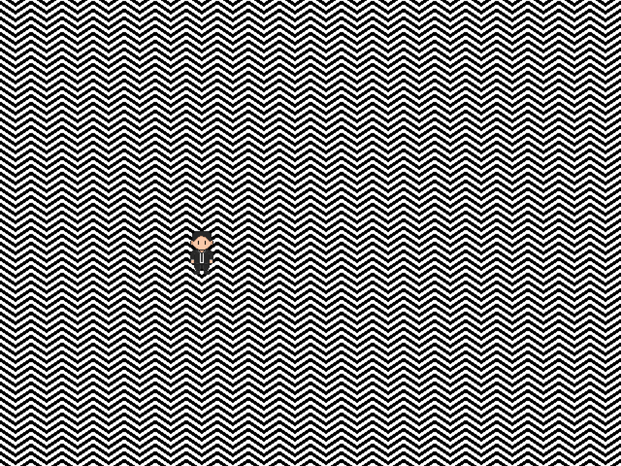
This is the first iteration of the floor tiles. I quickly scrapped this because i got a headache just from looking at it. The lines are each 4 pixels wide here.
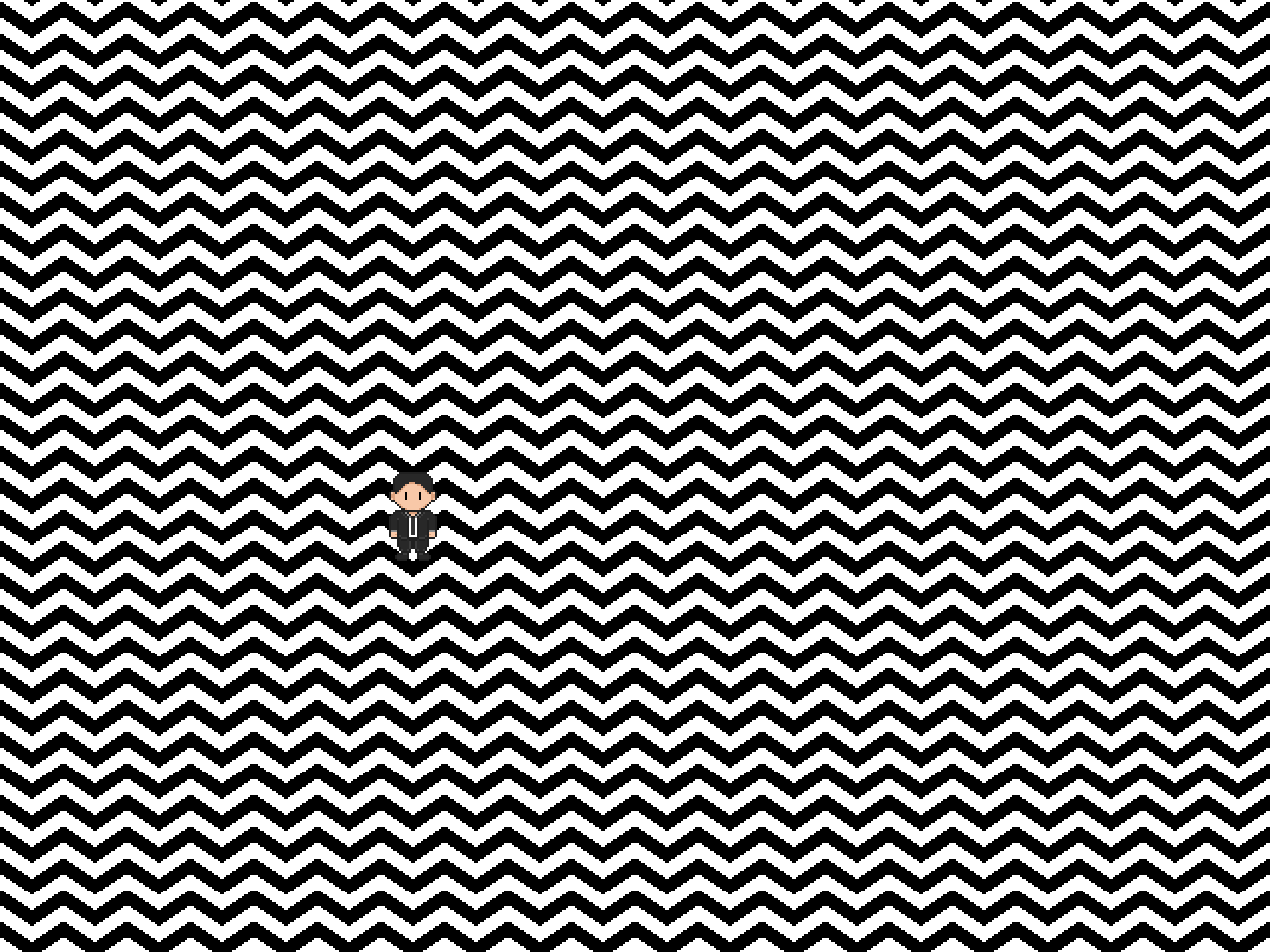
This is the second iteration, here i made the lines twice as wide (8 pixels) however i still thought it looked way to jagged, however i thought that making the lines even wider was a bad idea.
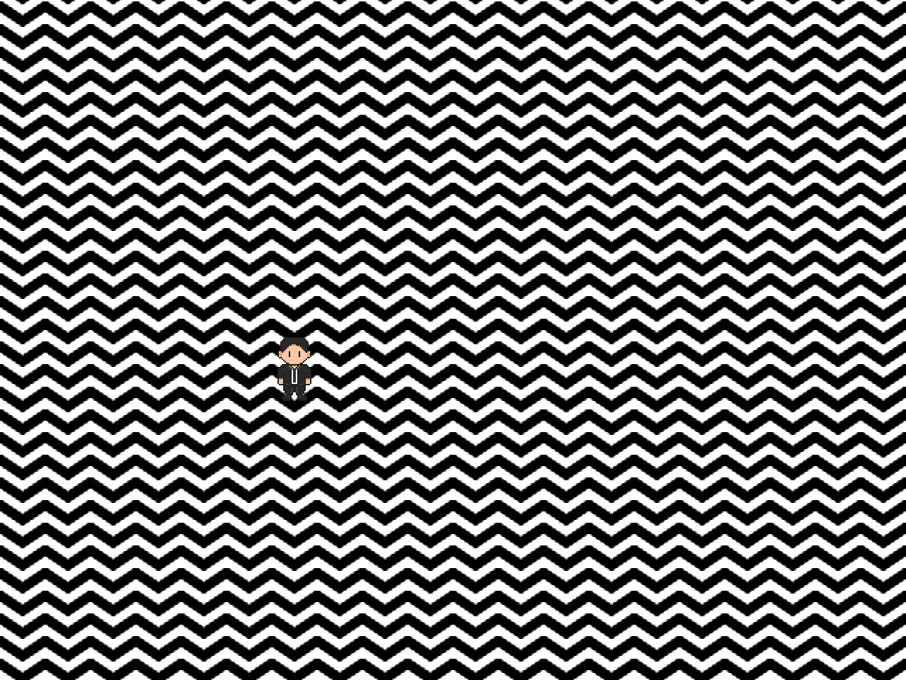
This is the third iteration, Much more smoother looking. How i did this is a fairly obvious solution: Anti-Aliasing. However since this is a 2D game i needed to do it by hand, not that it was much trouble since I've got plenty of experience with it. This is the iteration i ended up using however i did one more iteration to see if sideways would be better (see below), i also tried diagonally but i quickly saw that it would be a disaster to make that work so i just stuck to the 3rd iteration.
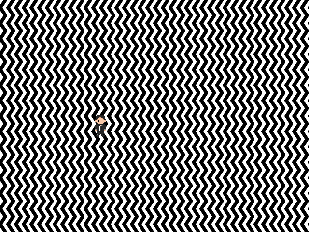
I think this is a good example how in game development every tiny change can make stuff look way better, which is why I wrote this post.
Get Wonderful and Strange
Wonderful and Strange
A Twin Peaks fan game
| Status | Released |
| Author | Rushkiller |
| Genre | Puzzle |
| Tags | Exploration, weird |
| Languages | English |
More posts
- Release DayDec 09, 2019
- 11/09/2017 - Release of the teaserSep 11, 2017
- 9/9/2017 - A month laterSep 09, 2017
- 13/8/2017 - 1 Week in developmentAug 13, 2017
- 5/8/2017 - Start of the gameAug 05, 2017
Leave a comment
Log in with itch.io to leave a comment.